Creative Brand Color Combinations That Make Designs Stand Out (Color Contrast Guide)
Discover creative brand color combinations and learn how contrasting colors influence brand perception, visual hierarchy, and marketing design.
COLOR INSPIRATION
Blog by Gargi | Social Antic Geeks
4/30/20263 min read
Color is one of the most powerful visual tools in design.
Brand Colors that will make you stand out!
Before someone reads your message or understands your product, their brain has already reacted to the colors they see.
That reaction influences how people perceive a brand.
Some color combinations create trust and calmness, while others create energy, excitement, or boldness.
The key to building strong visual identities is understanding how colors interact with each other.
In this guide, we explore several creative color combinations and explain how they can be used to create visually striking and memorable brand designs.
For each palette you’ll find:
• hex codes
• brand personality
• ideal applications
• practical design insights
Let’s explore
Geyser + Tree Green
Geyser — #DEDBF0
Tree Green — #18761B
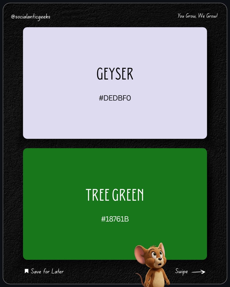
Brand Personality
This palette communicates:
• balance
• freshness
• natural stability
The soft pastel tone combined with a deep green creates a calm and grounded visual feel.
Best For
• eco-friendly brands
• wellness brands
• sustainable businesses
• organic product brands
Design Tip
Use Geyser as a soft background color while Tree Green can highlight key elements like icons, buttons, or section headers.
Warm Blue + Powder Pink
Warm Blue — #3A4BE3
Powder Pink — #FFAFDA

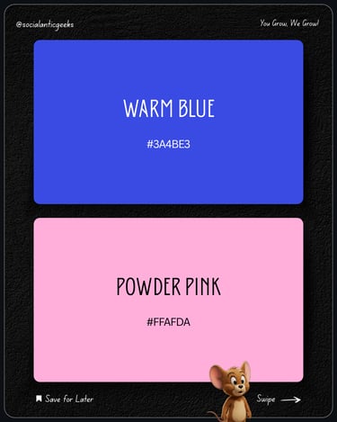
Brand Personality
This palette feels:
• playful
• modern
• energetic
The contrast between bold blue and soft pink creates a dynamic and youthful aesthetic.
Best For
• lifestyle brands
• creative startups
• social media brands
• digital creators
Design Tip
Use Warm Blue for strong visual sections and Powder Pink to soften the design and create balance.
Pale Lilac + Purplish Red
Pale Lilac — #E4CEF1
Purplish Red — #BA124F

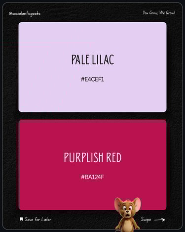
Brand Personality
This palette communicates:
• elegance
• creativity
• artistic expression
The soft lilac provides calmness while the deep red tone adds strong emotional depth.
Best For
• fashion brands
• beauty brands
• luxury product brands
• boutique businesses
Design Tip
Allow Pale Lilac to dominate the layout while Purplish Red highlights focal areas such as headlines or product features.
Electric Purple + Pale Lime
Electric Purple — #BA2BEC
Pale Lime — #C9F284
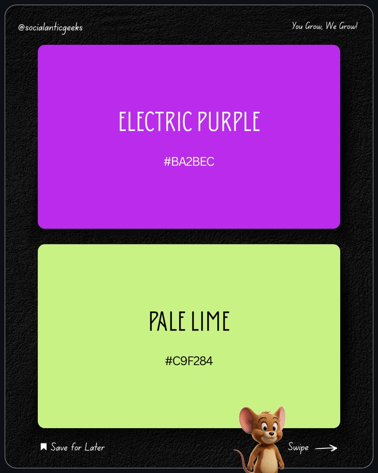

Brand Personality
This palette feels:
• futuristic
• bold
• experimental
It creates a strong visual impact and instantly grabs attention.
Best For
• gaming brands
• tech startups
• entertainment brands
• experimental creative brands
Design Tip
Use Electric Purple for dominant areas and Pale Lime for highlights, call-to-actions, or icons.
Ferrari Red + Satin Linen
Ferrari Red — #F00D0D
Satin Linen — #F0E2DB
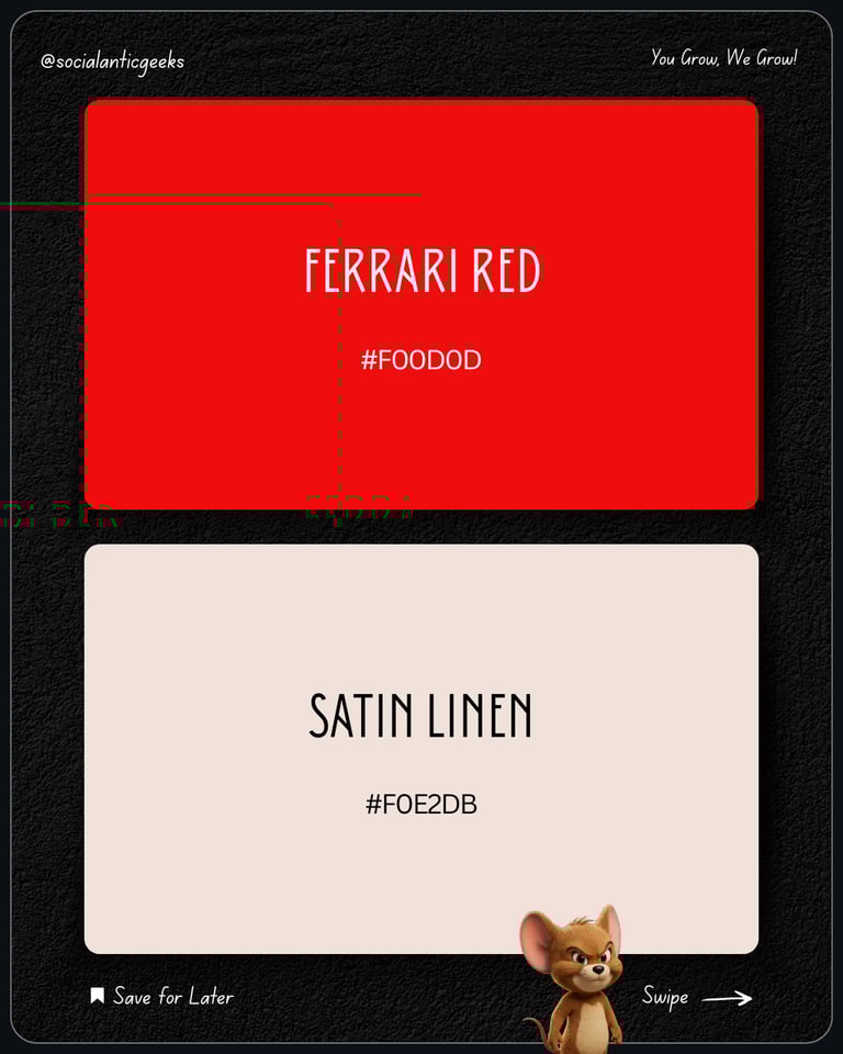

Brand Personality
This palette communicates:
• confidence
• power
• premium minimalism
The bold red brings strong energy while the soft neutral tone balances the palette.
Best For
• luxury automotive brands
• fashion brands
• premium services
• bold product brands
Design Tip
Use Satin Linen to keep layouts clean while Ferrari Red should be used for impactful highlights.
Understanding Color Contrast in Branding
One of the most important elements of strong design is contrast.
Contrast determines how easily people can understand a design.
Good contrast helps users quickly identify:
• headlines
• buttons
• important information
• call-to-action elements
Designers often use contrast to guide attention toward the most important parts of a layout.
When used correctly, contrast makes designs feel more professional and easier to navigate.
How Colors Influence Brand Perception
Different color combinations create different emotional responses.
For example:
Soft + Dark combinations
Often feel calm and trustworthy.
Bright + Neutral combinations
Feel energetic but balanced.
Bold + Bold combinations
Create strong attention and visual excitement.
Choosing the right balance helps brands communicate their personality more effectively.
Final Insight
Colors do more than decorate a design.
They shape how people feel about a brand.
A thoughtful color combination can instantly make a brand feel:
• modern
• premium
• bold
• memorable
That is why intentional color systems are a key part of strong branding.
Great design is not just about making things look good.
It’s about building visual systems that communicate clearly and consistently.
At Social Antic Geeks, we help brands design visual identities and marketing systems that attract attention and build stronger brand recognition.
If you want your brand to stand out with powerful design and strategy —
Let’s create something remarkable together.